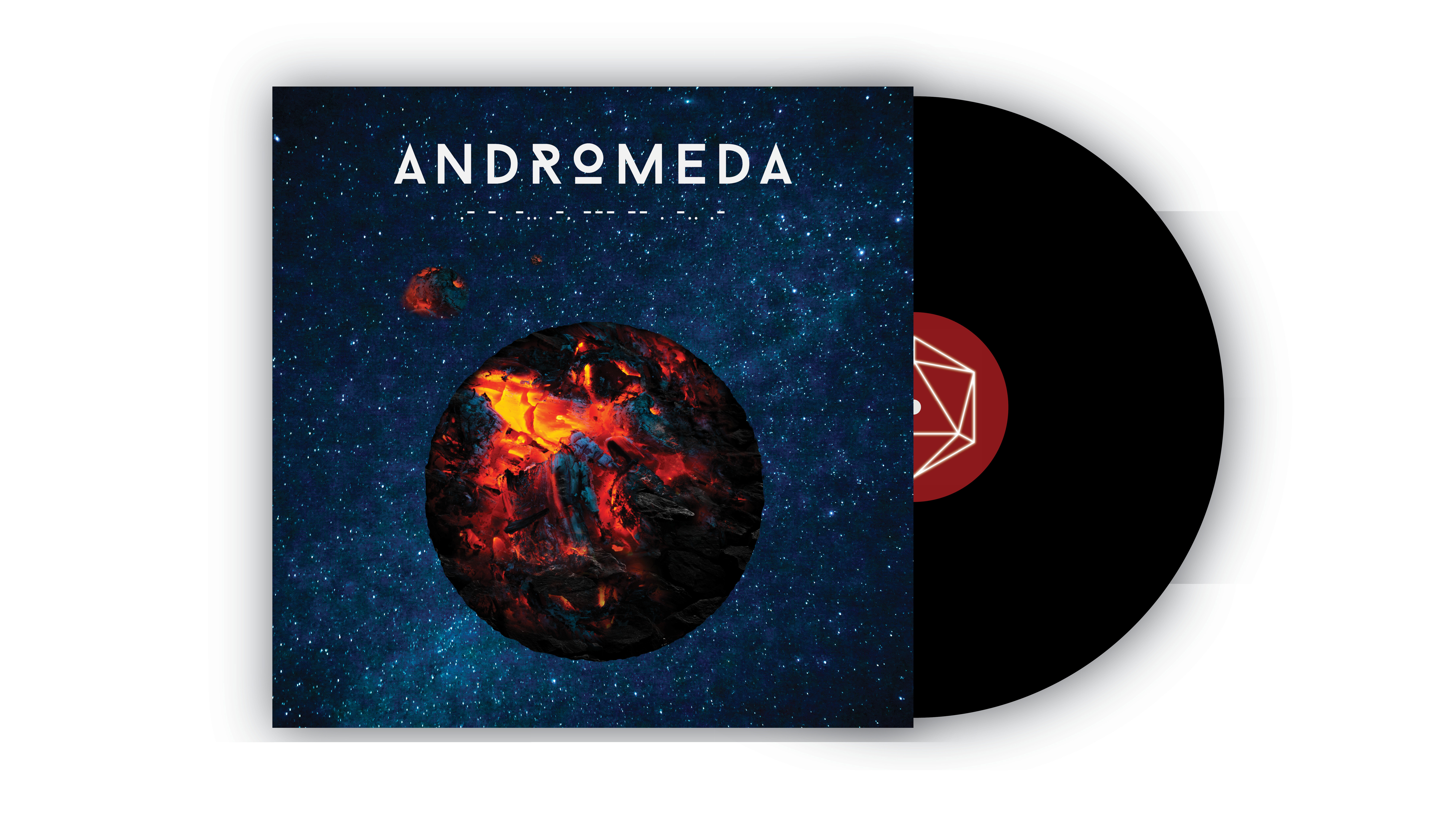
SCOPE: Brand Identity, Iconography, Illustration, Logo, Packaging, Photo Editing, Photography, Stationery, Typography, Website, UX/UI
CLIENT: Nova 9
CLIENT: Nova 9
I am particularly proud of the logo for this project because of its cleverness. Four “9s” rotated around a central point create the swirling motion of a nova. The colors in the logo represent the deep black color of space, and the saturated red color of a nova. The Sans serif typeface, Bahnschrift, complements the space theme and gives the brand a minimalistic, modern look.
One of Nova Nine’s core values is exploration. The branding is space themed and is intended to inspire people to explore new things; whether that is creating a totally unique and rad skateboard, skating somewhere you have never been, or just exploring anything in general.
