SCOPE: App, Brand Identity, Iconography, Illustration, Logo, Packaging, Typography, UX/UI
CLIENT: Raspados Riquísimos
CLIENT: Raspados Riquísimos
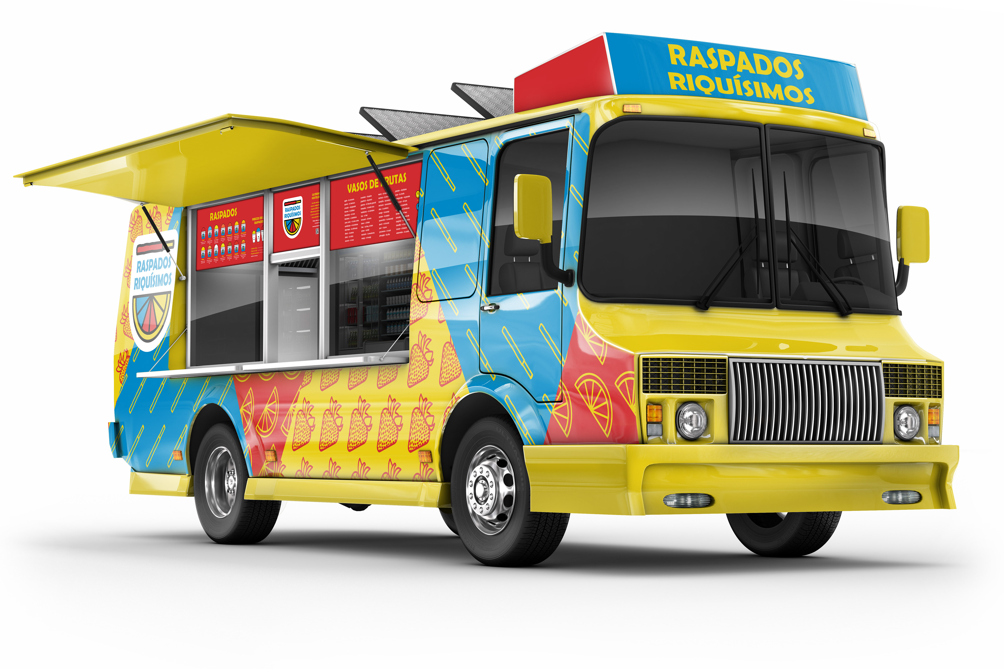
Raspados are a Mexican shaved ice treat that are known for their fruits, candies, and other colorful toppings. The logo design incorporates iconic parts of a raspado, Berlin Sans; a playful typeface, and a primary color scheme.
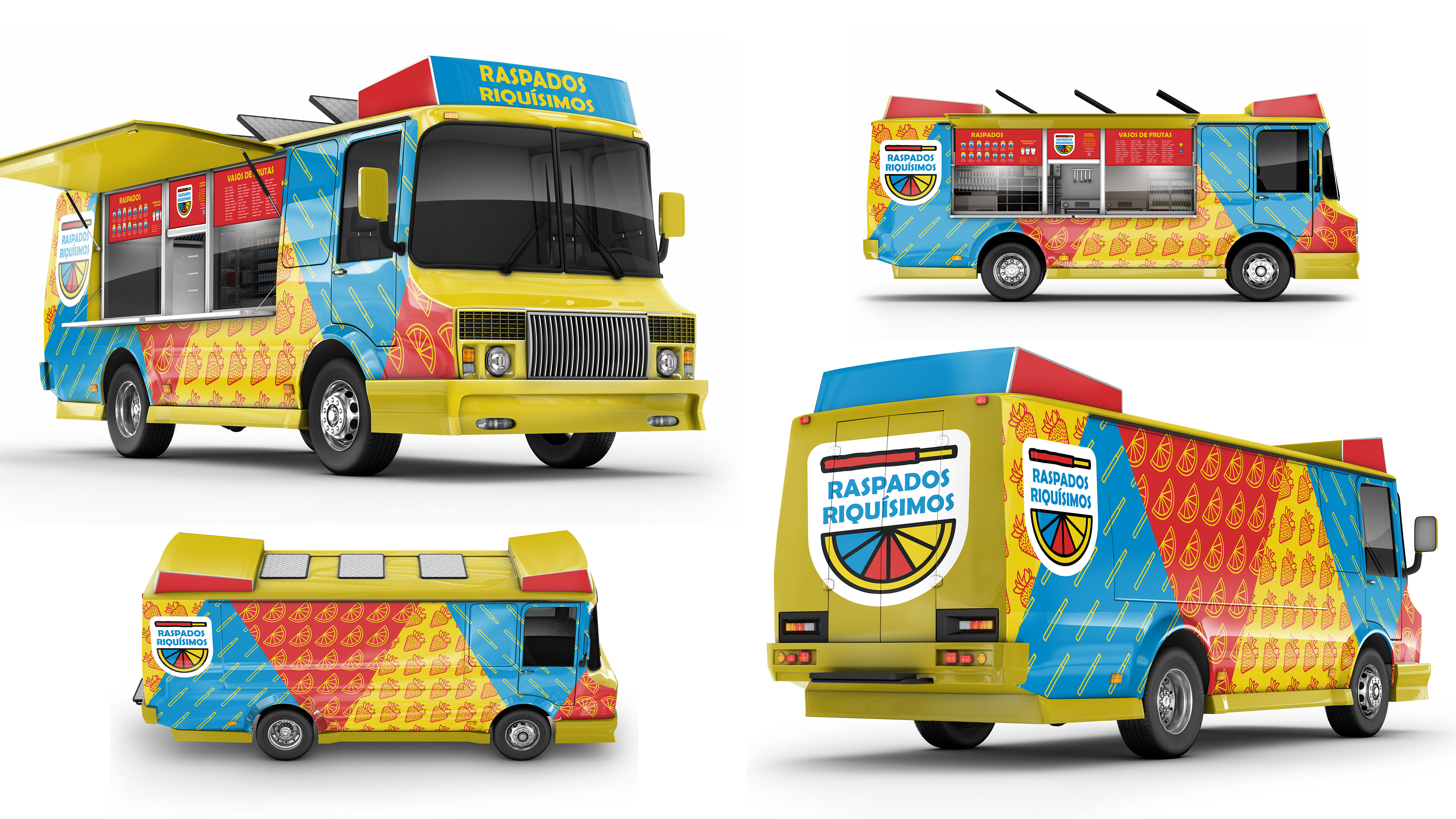
The tamarindo stick, fruit slice, and strawberry patterns along with their colored triangle backgrounds are orientated at alternating forty-five-degree angles to give the truck design movement and a playful look.
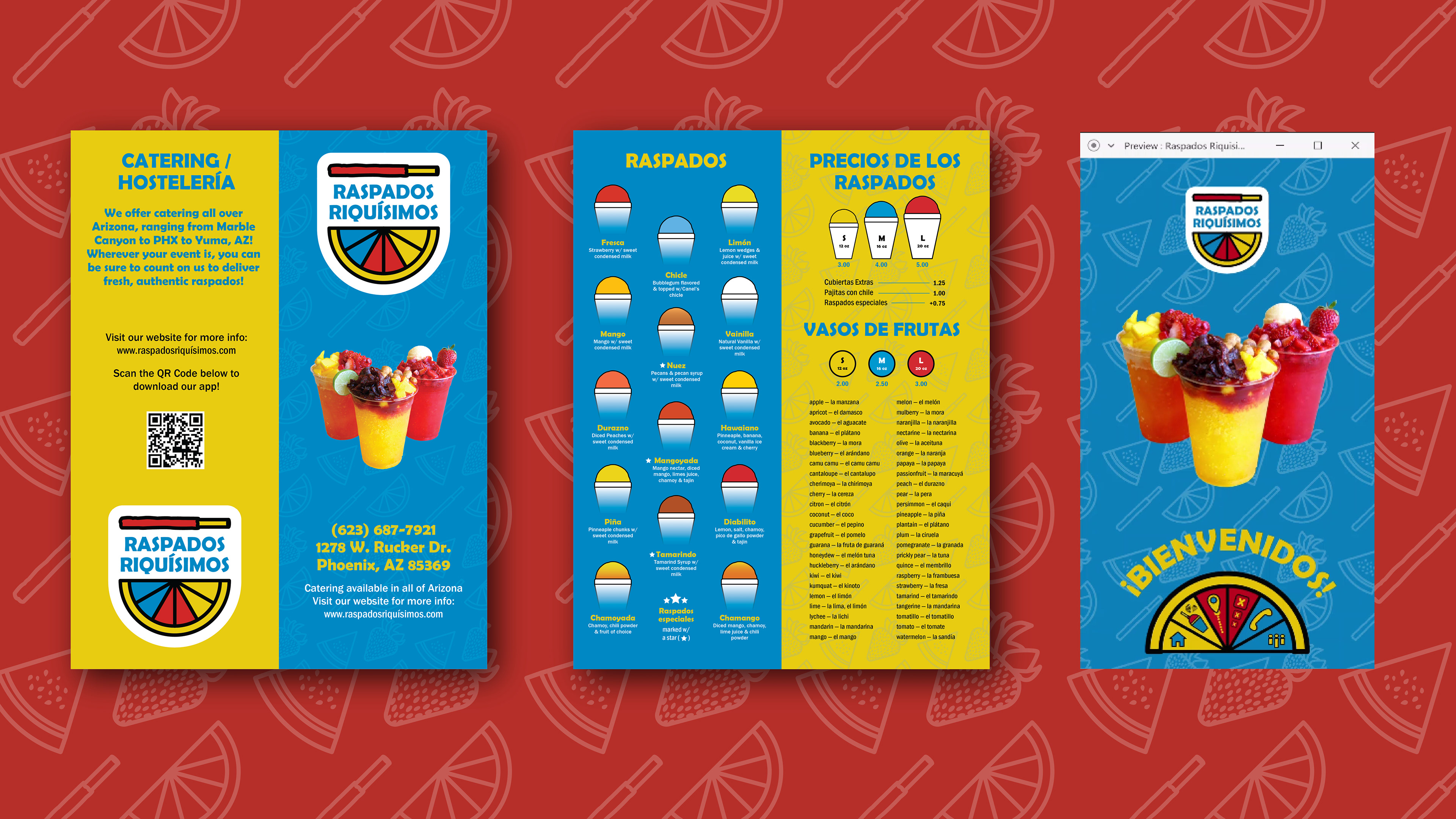
The menu design mixes Spanish and English words, validating the authenticity of the items while still making the descriptions understandable. The menu also complements the minimalistic design seen throughout the logo and truck design.
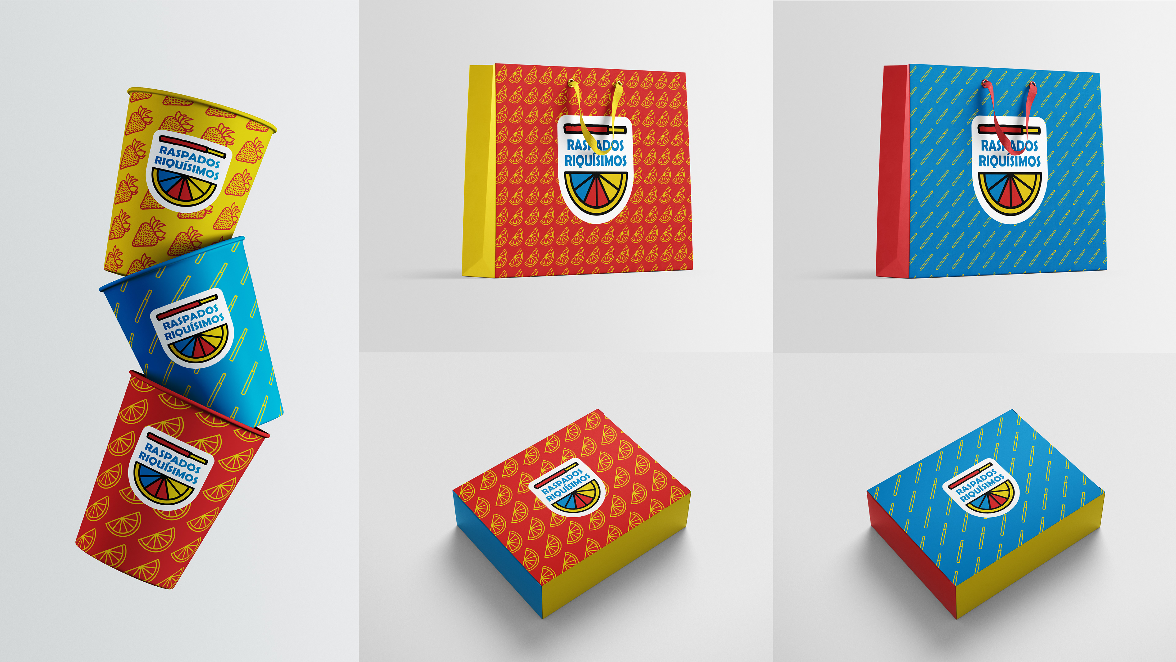
The pattern designs on the truck wrap are also used on the packaging designs along with bold blocks of the brand colors to make the patterns pop.
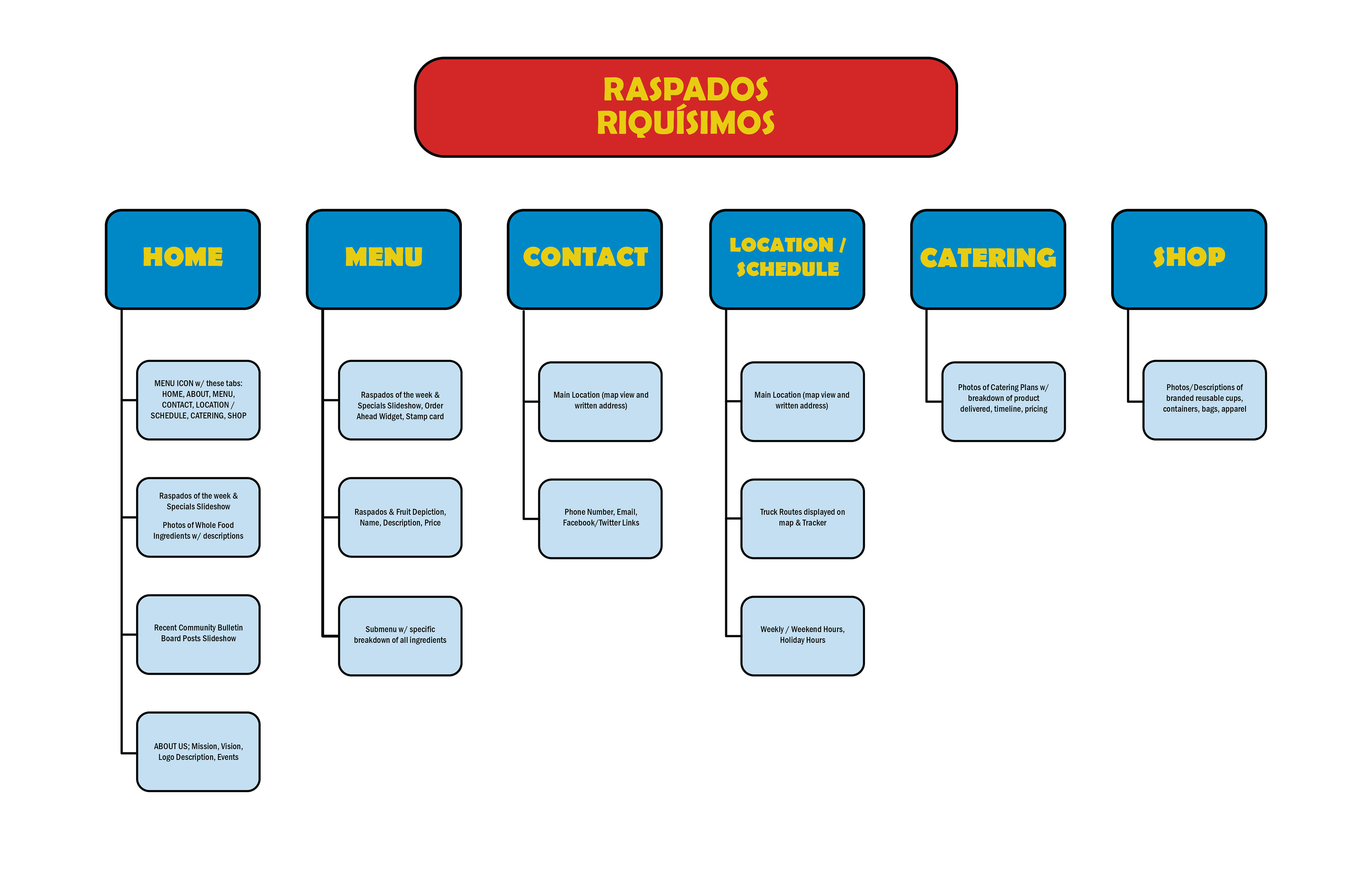
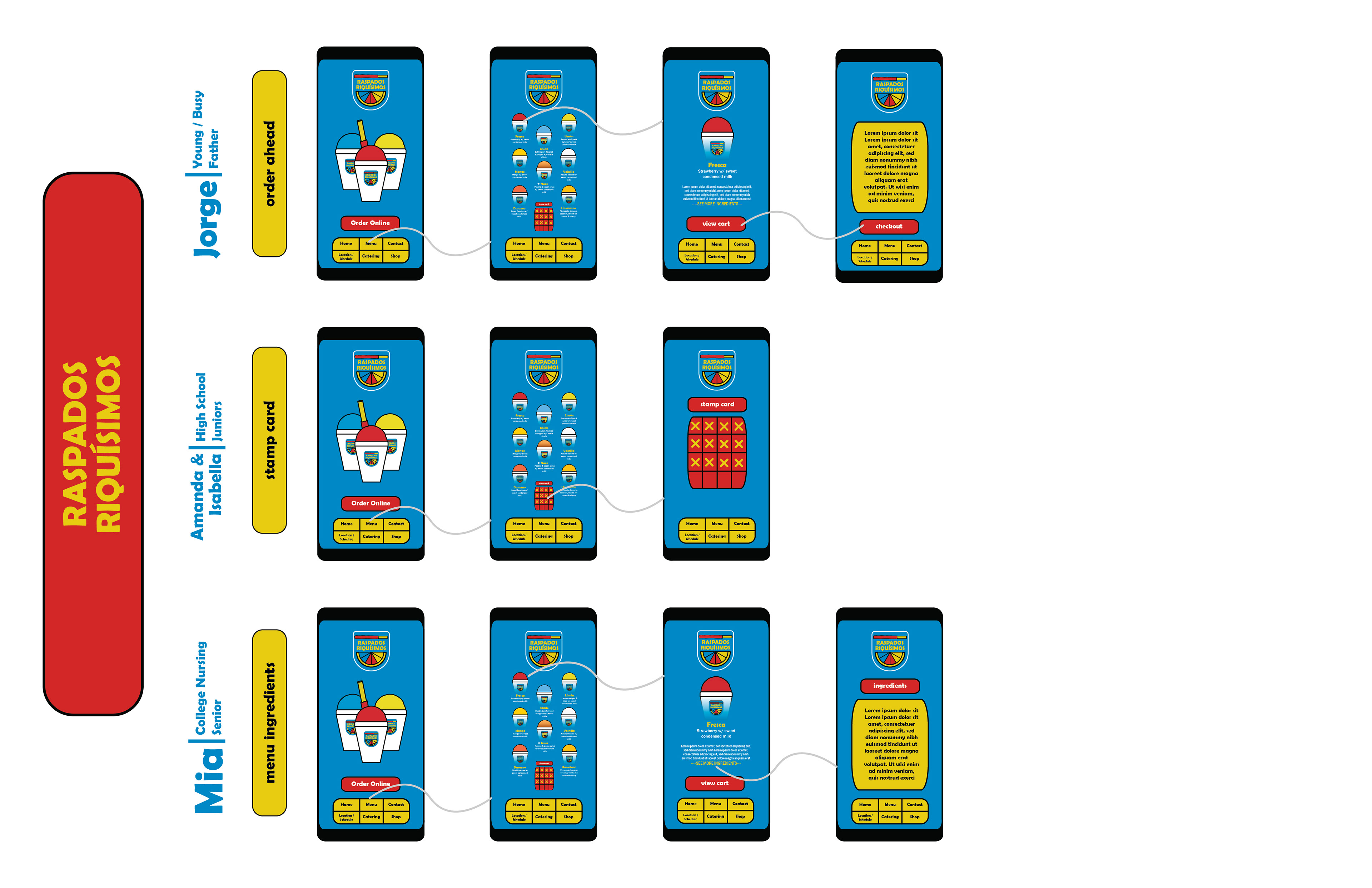
This was the initial sitemap and wireframe used to plan out the app design. I ended up going a different route that better complemented the paper menu design. The menu on the bottom of the app is the fruit wedge from the logo, further reinforcing the brand identity and making the navigation more fun and unique than most app menus.